
COPYRIGHTS AND RESTRICTIONS AND CONDITIONS OF THIS WEBSITE
RICHARD PRINCE • Cowboys
Gagosian Gallery, Beverly Hills, CA
February 21st - April 6th, 2013
In order to appreciate this collection of paintings by Richard Prince, it would help to be aware of these pieces of Fine Art that preceded it and to which these paintings speak upon:
1.) Andy Warhol’s Double Elvis
2.) The body of work by Fine Artist Jasper Johns, his Targets, American Flag and Numbers series.
3.) The paintings of Richard Diebenkorn.
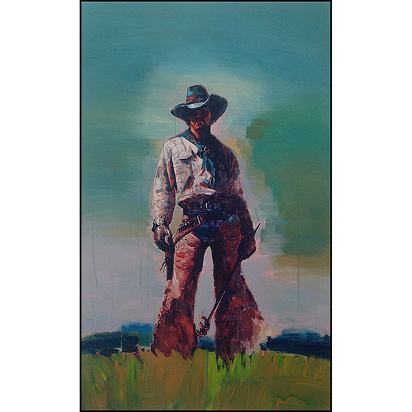
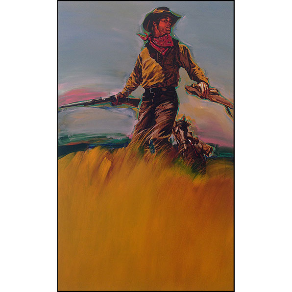
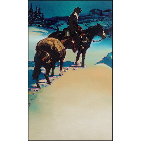
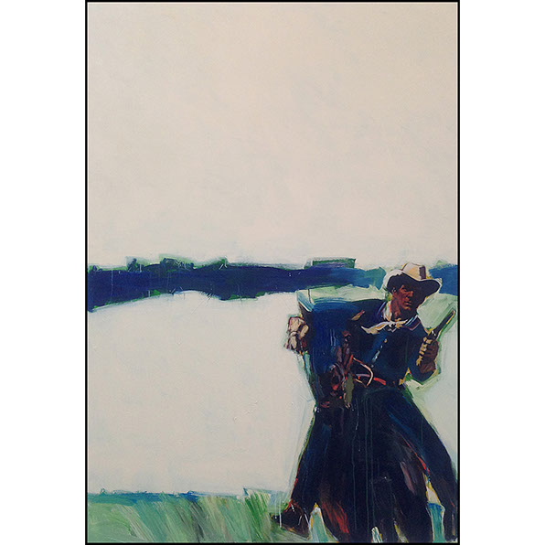
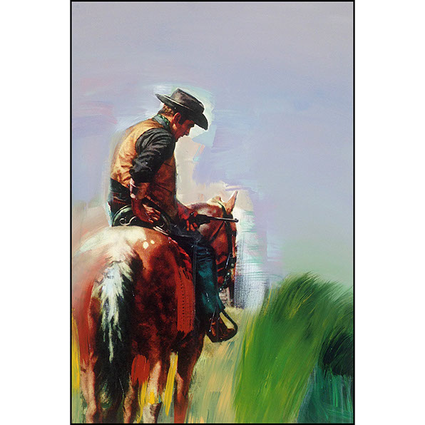
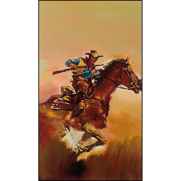
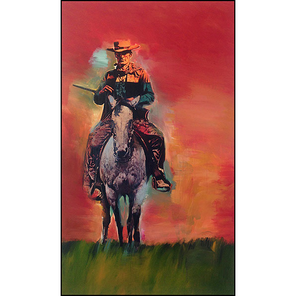
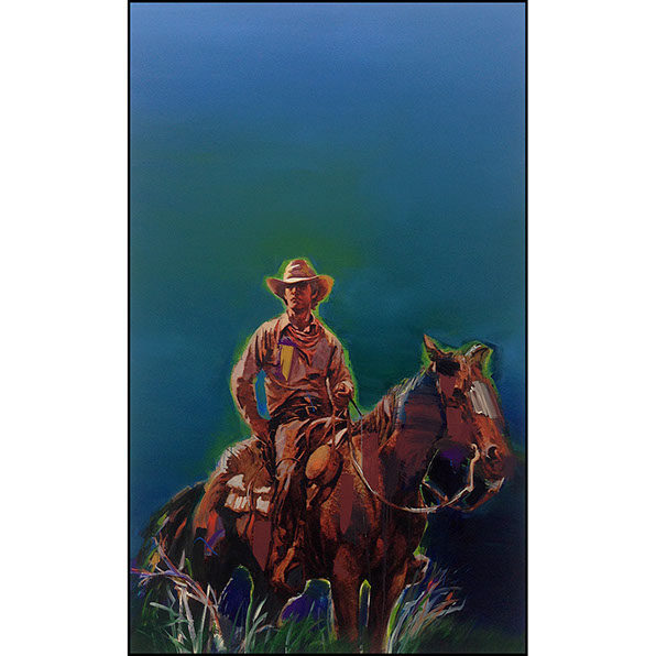
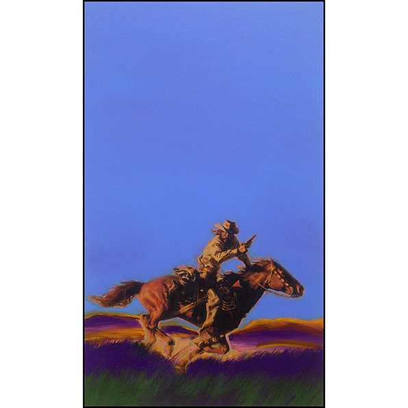
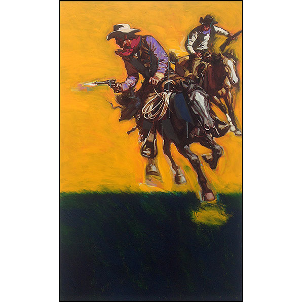
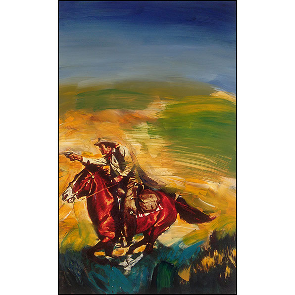
Richard Prince’s Cowboys series is not Illustration. These are not portraits of gunslingers or homages to America's wild, wild West. Rather they are portraits of lost masculinity and an homage to gender when being male meant being a maverick - stern, purposeful, vigilant and strong.
As judgmental as Warhol, as painterly as Diebenkorn and using a template to emotionally detail a familiar ‘mold’ like Johns, Prince usurps Cowboy illustrations from book cover art of the 1970s and through them holds up a mirror to how society sees men, sells to men, speaks about men and nurtures the male (and in a fashion female) ego.
By juxtaposing that visage some 40 years later and placing it in a era where the gender roles are abstract, Richard Prince observes that the Norman Rockwell portrait of the American family has painted over (literally) and replaced by a culture that only celebrates Capitalist pursuits. Within this new cultural twist, Prince sees the former 'head of household' like a deceased relative, like a Cowboy of the old West, repudiated and cast aside to find self-love in obsessions involving shaven body parts and chiseled physiques. Inside this theme, Prince’s Cowboys series is at once - nostalgic, heroic, celebratory and sad all at the same time.
But Fine Art is more than working within a theme of social commentary. It’s execution and to embellish his message, Prince made these adopted images of paperback cover art rather large so large you can not avoid them or their message; and he lavished them emotionally with painterly colors extrapolated from the original illustrations themselves.
And, the use of color here is no small feat. It can be as bold as simple interplay or as unusual as a light blue smattering in a field of red/orange. It can overwhelm or cause you to pull back. But within the application, it is brittle with electricity, stoicism, and peppered with sadness - like a painted photograph of a family member you never met or a handwritten note from your long departed Dad.
Richard Prince • Cowboys was on display at the Gagosian Gallery, Beverly Hills, California
from February 21st through April 6th, 2013.
© Richard Prince
Courtesy of Gagosian Gallery
Review is © Ron Barbagallo 2013
RICHARD PRINCE • COWBOYS
© 2013 Ron Barbagallo
© Richard Prince
<
>
All images are:
© Richard Prince. ALL RIGHTS RESERVED.
The author would like to thank Alexandra Magnuson, Gagosian Gallery, Beverly Hills, California for her help in assembling this work.
This review is owned by © Ron Barbagallo.
ALL RIGHTS RESERVED. You may not quote or copy from this article without written permission.
YOUR USE OF THIS WEBSITE IMPLIES YOU HAVE READ AND AGREE TO THE "COPYRIGHT AND RESTRICTIONS/TERMS AND CONDITIONS" OF THIS WEBSITE DETAILED IN THE LINK BELOW:
LEGAL COPYRIGHTS AND RESTRICTIONS / TERMS AND CONDITIONS OF USE
INSTRUCTIONS ON HOW TO QUOTE FROM THE WRITING ON THIS WEBSITE CAN BE FOUND AT THIS LINK.
PLEASE DO NOT COPY THE JPEGS IN ANY FORM OR COPY ANY LINKS TO MY HOST PROVIDER. ANY THEFTS OF ART DETECTED VIA MY HOST PROVIDER WILL BE REPORTED TO THE WALT DISNEY COMPANY, WARNER BROS. OR OTHER LICENSING DEPARTMENTS.
ARTICLES ON AESTHETICS IN ANIMATION
BY RON BARBAGALLO:
The Art of Making Pixar's Ratatouille is revealed by way of an introductory article followed by interviews with production designer Harley Jessup, director of photography/lighting Sharon Calahan and the film's writer/director Brad Bird.
Design with a Purpose, an interview with Ralph Eggleston uses production art from Wall-E to illustrate the production design of Pixar's cautionary tale of a robot on a futuristic Earth.
Shedding Light on the Little Matchgirl traces the path director Roger Allers and the Disney Studio took in adapting the Hans Christian Andersen story to animation.
The Destiny of Dalí's Destino, in 1946, Walt Disney invited Salvador Dalí to create an animated short based upon his surrealist art. This writing illustrates how this short got started and tells the story of the film's aesthetic.
A Blade Of Grass is a tour through the aesthetics of 2D background painting at the Disney Studio from 1928 through 1942.
Lorenzo, director / production designer Mike Gabriel created a visual tour de force in this Academy Award® nominated Disney short. This article chronicles how the short was made and includes an interview with Mike Gabriel.
Tim Burton's Corpse Bride, an interview with Graham G. Maiden's narrates the process involved with taking Tim Burton's concept art and translating Tim's sketches and paintings into fully articulated stop motion puppets.
Wallace & Gromit: The Curse Of The Were-Rabbit, in an interview exclusive to this web site, Nick Park speaks about his influences, on how he uses drawing to tell a story and tells us what it was like to bring Wallace and Gromit to the big screen.
For a complete list of PUBLISHED WORK AND WRITINGS by Ron Barbagallo,
click on the link above and scroll down.
INDEX OF SERVICES
The Ethical Method of Repair
The Attention is in the Details
the Lost and FOUND series
RON BARBAGALLO: