
COPYRIGHTS AND RESTRICTIONS AND CONDITIONS OF THIS WEBSITE
Told with emotion reverent to Danish author Hans Christian Andersen’s writing, Disney’s adaptation of The Little Matchgirl follows on the heels of the studio’s recent Academy Award® nominated shorts Destino and Lorenzo. Offering a glimpse of what may be coming from Disney’s newly expanded shorts program, The Little Matchgirl marks Disney’s 5th adaptation of Andersen and was directed by Roger Allers.
“Matchgirl got its start in 2002.” co-producer Baker Bloodworth recalls, “Roy Disney was intent on creating this Fantasia sequel which we were calling The Music Project. It was intended to be a compilation of shorts that featured music and was to be representative of different sounds and cultures.”
“We were looking for international stories” producer Don Hahn continues “and Matchgirl made sense for this. It is something that could be done in pantomime and to music. Hans Christian Andersen is a well we’ve gone back to many times and was always good. He’s solid and always timeless.”
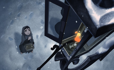
As dusk comes on New Years Eve, The Little Matchgirl watches as a street lamp is illuminated.
The placement of values and color were key to setting the right emotional tone for The Little Matchgirl.
Visual development by Ed Ghertner (left) illustrates how soft, almost dream-like tones blur and blend into each other as they lead the viewer's eye down a long lonely street. The finished screen shot (right) shows how yellow or orange tones were used as a visual metaphor for warmth and hope, the feelings which overwhelm the little match girl as she mourns her Grandmother who passed away a week earlier on Christmas Eve.
SHEDDING LIGHT ON THE LITTLE MATCHGIRL
Originally published as part of Andersen’s fifth volume of Fairy Tales in 1848, The Little Girl with the Matches is an original Andersen story inspired by a Johan Thomas Lundbye drawing and loosely based on an incident that happened to Andersen’s mother when she was a child. Written nine years after Andersen’s friend and colleague Charles Dickens finished Oliver Twist, The Little Match Girl shed a light on a very oppressed and silent group in Europe -- its children. Andersen’s essay spoke out for exploited children sent by their parents to beg in the streets and for children of all economic brackets living at the time when one out of every two children routinely died before the age of five.
The task of translating Andersen’s somber, poetic prose went to Lion King co-director Roger Allers, who continued on with the project as it went from the music feature to short. The veteran director led a team of artists and painters during downtime from other projects at Disney’s Burbank and Paris Studios to create a seven-minute short and turn Andersen’s poignant words into meaningful animation.
This was a challenge, in many ways, because the story of the match girl is also a study in contrasts: life vs. death; rich and poor; cold and warm, not just in temperature but also in temperament. “Our lead character goes through a lot of emotional changes;” Allers observes “We see her plight with the bitter cold, and we see her shift in and out of visions of comfort and escape. Aesthetically it was a big challenge to make the shifts from dream back to reality.”
Finding music with the right sort of feeling was important, which Don Hahn did with Alexander Borodin’s dreamlike String Quartet No. 2 in D Major: Third Movement: Notturno (Andante). It also became the inspiration to move the Christmastime story to the isolated streets of pre-revolutionary Russia. “The Borodin piece has so much pathos in it, and seemed to fit the construction of the story so well. Once Roger put the storyboards to music,” executive producer Roy E. Disney noted “you couldn’t help look at it and go ‘Oh, that really works!’”
A line drawing by Mac George (right) and a black and white value study by Ralph Zondag (left).
Visual development by Hans Bacher (left) and a pencil drawing by an un-attributed production artist (right).
The production went on over a four year period where Allers was asked to come back from projects outside Disney to attempt several alternate, more upbeat endings. Ultimately the executives let Allers restore his original ending, which was faithful to Andersen’s original intent and is as much a mirror for our indifference today as it was in the 1850s. “We’re not in the business of sending political messages.” Don Hahn explains. “But it is a story of hope and Roger wanted to be genuine to the original story and to his credit he persevered to tell that story. In a way the ending is almost prayerful, too, without being religious. It was a way to show hope and that all children have a right to exist, and that’s a really poetic notion.”
The Little Matchgirl made its world debut at Annecy in France on June 5, 2006. It went on to win Best Film For Children at the 17th Festival of Animated Films 2006 Animafest World Festival of Animated Films Zagreb and will be available as part of the extras on the The Little Mermaid special edition DVD, available for sale starting Oct. 3, 2006.
Two pieces of visual development art by Hans Bacher.
Media: watercolor on paper (left) and gouache on paper (right).
© Walt Disney Company.
When Hans Christian Andersen wrote The Little Match Girl almost 160 years ago it was at a time in his career when he was well past adapting spoken fairy-tales for the printed page. Like The Little Mermaid or The Ugly Duckling, many of Andersen's original stories often contained a moral.
However, unlike those fables, the moral of The Little Match Girl was not found directly within its storyline. Instead it was written to provoke thought and to gain the attention of Europe's privileged masses, many of whom could well afford to buy one of Andersen's volumes but treated their children like property or indentured servants.
Case in point: Andersen's own mother as a child was sent out to the streets to beg by her father, and on one occasion was so scared to come home empty-handed that she hid under a bridge during winter and nearly froze to death. Scenarios like this where children are treated like possessions are more common than we imagine and play themselves out today in many places that escape our day to day notice in the poorest parts of the world, in Africa, the Middle East and in Asia.
Like many visionaries before him, Andersen's story of the match girl was a societal wake-up-call, an artistic cry for help and a slap at indifference.
Director, Roger Allers understood the sentiment behind The LIttle Match Girl and discusses how he went about translating Andersen's written words to animation.
Also the people walking, the Russians walking with their fur coats and the elegance of pre-revolutionary Russia, which also romantically speaks to me; that era when Russia was all obsessed with France. It was just really beautiful. Incredibly beautiful, if you were of those classes.
Roger Allers:
When Don Hahn came to me with a proposal to set Little Matchgirl to music as a short, I was thrilled with the idea because it was a favorite story of mine. The idea of doing it as a musical piece and to do it justice was a thrill.
I was one of the three main board artists on this short. It was lovely to go back and spend time boarding since for many years at Disney that's what I did. As I started to break down the scenes and come up with the images to match up with the music, the color palette became really obvious. It simply presented itself to me while I was just drawing.
(I decided) that all the scenes of her daily life and her struggles in the city would be very cool and very colorless; a lot of grays, blue-grays and that sort of thing to help you feel the cold and to feel the emotional coldness of her existence.
I wanted her visions in the fire, in the flame of the matches, to be warm and bring out all the warm, earthy colors: the colors of comfort, of home and hearth.
At the same time I had Hans Bacher do some character sketch ideas for the match girl. He was working with ink and ink washes. He does this wonderful, quick shorthand when he’s working with his designs. The way the ink would trail off and fade out and the texture of the paper that came up underneath was so exciting to see. That’s what initiated the idea to do the whole movie as a watercolor wash and to really let the texture of the paper play underneath and to keep it very simple and very thin.
We had to look for techniques to accomplish that, even though our characters were painted in the computer. (We found) computer techniques that we could use to create a sense of texture and the way the color would bleed out towards the end of the outline of the character.
There were a few elements from Andersen's story that were altered for your adaptation of the story. The location of the story was changed to an Eastern European location, something that resembles St. Petersburg. What was the reason for the location change?
Roger Allers:
It was partly our choice of music [Alexander Borodin’s String Quartet No. 2 in D Major: Third Movement: Notturno (Andante)] and partly the opportunity of the visual allure of doing pre-revolutionary Russia in terms of the architecture and I guess also because, if you think about a place like Russia, that place looks so archetypically cold. Holland is so charming, not that it wouldn’t have been grim to be poor in Holland I would imagine.
But setting it in Russia said something little bit more to me, (about) the division of the classes in pre-revolutionary Russia for one thing, especially before the revolution when the people were close to rioting on several occasions and were brutally put down. I thought it would be a poignant stage to play upon.
Much of Andersen's writing in The Little Match Girl is told in metaphors and with poetic license. One of the tools he uses in Match Girl is to contrast everything from class structure to the contrast of emotions: compassion and indifference and the worlds of life and death. An element from the story alluded to in the short is the love the match girl received from her beloved grandmother. In the short story it is further explained that her grandmother died a week earlier and that the match girl is left with an overbearing and cruel father. What sort of filmmaking decisions did you make in dealing with explaining her relationships at home?
Roger Allers:
Well, for one thing, it’s a very short piece and we were doing it with no dialogue, purely to music where it all would have to be communicated in pantomime and it just seemed like a complication to start dealing with the parental relationship ahead of it. (It would have cut) into a lot of screen time.
As it is, I think of it as being so incredibly compressed. It was a rush to get through each of the four steps we did take through it. So we decided it would be better to jump into the middle of the story. I think it would raise more questions than it would answered for people.
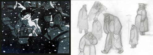
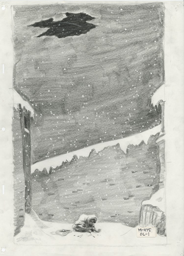
Two early pieces of visual development art by Sue Nichols.
Both firmly illustrate the contrast of indifference and affection within the match girl's home life.
© Walt Disney Company.
Even if there was someone there, it was someone she could not go home to. I didn’t want to have to address that it was abusive on screen. So it was better to just go right to the heart of it where it’s this girl against the world. A girl alone. It seems like it made her pining for comfort and love much stronger when she was alone among all those people and then we can go to those visions of her being wrapped up in warmth of her grandmother.
One of the more poignant moments in the film involves the sequence where the match girl finally greets her grandmother after making several attempts. In many ways the emotion that plays out in this scene foreshadows the ending of the short. Could you explain what you did to layer the emotion from this scene into the next?
Roger Allers:
Ah, the scene where the match girl runs into her grandmother’s arms, that was part of that whole thing of her traversing from one world to the other; from the cold world of reality to the warm world of her dream and her desire, and to be scooped up in the grandmother’s arms as an image of comfort and everything.
And then there was the idea of the Christmas tree, which was to represent everything that was wonderful and warm and delightful about the way a childhood was supposed to be. The feeling of looking at your childhood Christmas tree and all that and she [the lIttle matchgirl] gets to light the candles on the tree.
When I showed the film to Glenn Keane at the studio, he got it right away. After it was over, Glenn and I talked about the scene where the grandmother was holding the matchgirl and lighting the candles, and Glenn said in that moment when she was in her grandmother’s arms and lighting the candles and looking at the tree, he knew she was dead.
And I thought, "Wow, that was fairly perceptive," because that in my mind was also the moment at which the match girl was fully embraced by the spirit of her grandmother.
(Then) we went ahead and brought the grandmother (corporally) into the alley, and have her (the grandmother) symbolically wake up her (the little matchgirl) and carry her off. That whole thing of being held in her grandmother’s arms was a symbol of giving herself up to the warmth and the spirit of her grandmother.
© 2006 Ron Barbagallo


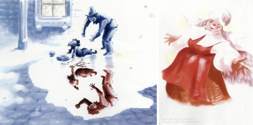
Art Director MIke Humphries skillfully employs the use of complementary colors — blues and oranges to display the contrast of feelings that sweep over The Little Matchgirl. Humphries' concept art depicts a horse-drawn sled (top left), which whisks the match girl from the cold wintry blues to the warm glowing Christmastime embrace she received from her Grandmother just a week before (top right). Similarly, Humphries uses blues and grays to illustrate the cold cruel reality of the match girl's day-to-day existence (bottom row).

Early during production Allers decided the film should be done using 2D pencil animation and have a hand painted look to it. Some of that inspiration is owed to the character designs of Randy Haycock and the thoughtful watercolors of Hans Bacher, which became the springboard for some elaborate computer coloring.
“Roger was adamant that we pursue a watercolor look for the film,” explains art director Mike Humphries. “We spent several months experimenting with paints, pigments, and just trying to find the right paper. We didn’t want the texture to be terribly obvious, but we also didn’t want it to be so subtle that you didn’t notice it was art.”
One of the film's big challenges was figuring out how to integrate the characters into the hand painted watercolor backgrounds. They were able to do this in the CAPS system by processing the line drawings to give it the appearance that pigment pooled towards the edges of the paint shapes as it does in real watercolor paintings. They were also able to create a mottled grain within the painted character.
Watercolors using brisk washes of very diluted translucent paint were created by Hans Bacher (all the art above). The way the paint fell on the textured paper was the springboard for the look of the film.
A screen shot from the finished short showing the color influence and visual development style of the film's pre-production art on the finished look of the film.
That watercolor look made its way into the background paintings and can be felt here in these three conceptual paintings by George Taylor. These three pieces illustrate how much care was taken in developing the look of the film. The painting to the left is the same image but with a more aqua blue hue to it, while the painting to the far right has more of an indigo blue hue. The painting in the center, the one with the cold, gray-black hues is the one whose color palette appears in the film.

A CLOSER LOOK -
Roger Allers on directing The Little Matchgirl
© 2006 Ron Barbagallo


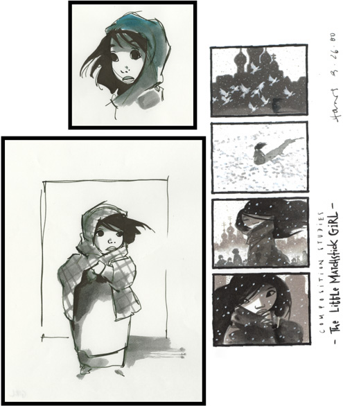
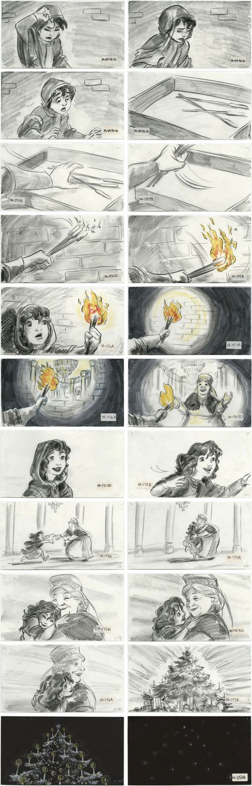
All story sketches were drawn by Roger Allers.
Media: graphite pencil and colored pencil on paper. Size: 5 1/2 inches by 10 inches.
© Walt Disney Company.
Roger Allers:
And then, I have to say one of my favorite parts was the idea that follows -- the idea of having the lit candles fade when we go to dark. The lights of the candles fall and become the snow as I transition back to the real world and we discover the girl dead in the alley.
It’s funny because you do use small things like snow and other atmospheric elements, pinpoints really, whether it’s the shooting star at the end of the film or the snowflakes from the beginning and throughout the film or the candle lights on the Christmas tree, as connective devices to link, move or float one scene into another. It becomes like a ballet of sorts and moves the short forward from beginning to end.
Roger Allers:
What you're talking about is the choreography, the motifs that lead you through the storyline. You have your two points of light that we play with in the picture.
First it’s the snow. This is how the picture opens: with snowflakes. So it’s the snowflakes and then flames. Each is the opposite of the other, emotionally and temperature-wise. You have the frozen snow and you have the warmth of the flame.
But in a way they’re kind of the same thing and in the very end, our last light is both warm and cold: the falling star. There’s almost nothing colder than the distant star but, at the same time, it is the symbol that she had gone to heaven. The ultimate warmth of her condition.
It’s interesting (that) sometimes, when you’re doing these things, you’re not thinking about them entirely. I think these symbols come up more spontaneously, or maybe that’s just the way I work. It’s one of the things I love about doing animation just to music is that it is a dance. Animation and music complement the other.
All images are © Disney Enterprises Inc.
The author would like to thank Baker Bloodworth, Don Hahn, Roger Allers, Howard Green, Doug Engalla, Sarah Baisley and Ray Morton for their help.
This article and interview is owned by © Ron Barbagallo.
ALL RIGHTS RESERVED. You may not quote or copy from this article without written permission.
YOUR USE OF THIS WEBSITE IMPLIES YOU HAVE READ AND AGREE TO THE "COPYRIGHT AND RESTRICTIONS/TERMS AND CONDITIONS" OF THIS WEBSITE DETAILED IN THE LINK BELOW:
LEGAL COPYRIGHTS AND RESTRICTIONS / TERMS AND CONDITIONS OF USE
INSTRUCTIONS ON HOW TO QUOTE FROM THE WRITING ON THIS WEBSITE CAN BE FOUND AT THIS LINK.
PLEASE DO NOT COPY THE JPEGS IN ANY FORM OR COPY ANY LINKS TO MY HOST PROVIDER. ANY THEFTS OF ART DETECTED VIA MY HOST PROVIDER WILL BE REPORTED TO THE WALT DISNEY COMPANY, WARNER BROS. OR OTHER LICENSING DEPARTMENTS.
ARTICLES ON AESTHETICS IN ANIMATION
BY RON BARBAGALLO:
The Art of Making Pixar's Ratatouille is revealed by way of an introductory article followed by interviews with production designer Harley Jessup, director of photography/lighting Sharon Calahan and the film's writer/director Brad Bird.
Design with a Purpose, an interview with Ralph Eggleston uses production art from Wall-E to illustrate the production design of Pixar's cautionary tale of a robot on a futuristic Earth.
Shedding Light on the Little Matchgirl traces the path director Roger Allers and the Disney Studio took in adapting the Hans Christian Andersen story to animation.
The Destiny of Dalí's Destino, in 1946, Walt Disney invited Salvador Dalí to create an animated short based upon his surrealist art. This writing illustrates how this short got started and tells the story of the film's aesthetic.
A Blade Of Grass is a tour through the aesthetics of 2D background painting at the Disney Studio from 1928 through 1942.
Lorenzo, director / production designer Mike Gabriel created a visual tour de force in this Academy Award® nominated Disney short. This article chronicles how the short was made and includes an interview with Mike Gabriel.
Tim Burton's Corpse Bride, an interview with Graham G. Maiden's narrates the process involved with taking Tim Burton's concept art and translating Tim's sketches and paintings into fully articulated stop motion puppets.
Wallace & Gromit: The Curse Of The Were-Rabbit, in an interview exclusive to this web site, Nick Park speaks about his influences, on how he uses drawing to tell a story and tells us what it was like to bring Wallace and Gromit to the big screen.
For a complete list of PUBLISHED WORK AND WRITINGS by Ron Barbagallo,
click on the link above and scroll down.
STORY SKETCHES
INDEX OF SERVICES
The Ethical Method of Repair
The Attention is in the Details
the Lost and FOUND series
RON BARBAGALLO: